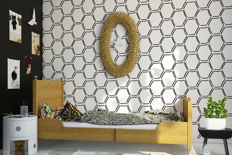
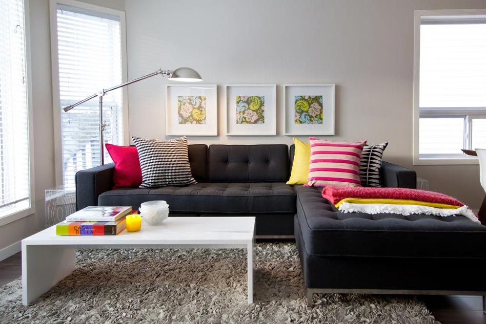
A room’s accessories bring it all together, make it unique, brighten it up, and give it a finished look. A house has no soul if it doesn’t have these little accessories. It’s incredible how simple decorative pieces and accessories can have such a significant impact on a space. Designers of Home Decor Accessories in Bangalore know how to properly integrate rugs, lighting, sofa cushions, art, and other furnishings.
Tips to Accessorise Your Home like A Pro
Professional home designers have the intuitive opportunity to innovate and accessorise a room to become a complete house. Designers utilise various strategies when decorating rooms, but we all have our personal preferences. This is because the majority of these tips, or plans, if you would like to seem more advanced, actually do work in various situations. You’ll succeed if you prepare ahead and follow the same steps as experienced interior designers. To help you accessorise your home like a pro, we have compiled a list of some of our favourite home-accessory tips.
1. Prefer Quality over Quantity –
Mass-produced products are readily available and inexpensive at your nearby Home Decor Accessories Shop in Bangalore, but do you want them in your home? Whenever it comes to the furnishings and decorations of a room, less is typically more. One distinctive piece may function better in your decor than a collection of cost-efficient accessories.
2. Select Appropriate Accessories –
You’ve probably been to homes where the inhabitants made the mistake of putting a postage-stamp-sized rug in a room that was the size of a coliseum. Likewise, too-large paintings crammed into too-small walls. Take the time to consider scale and proportion, and what works best in the area you have available before selecting and arranging any accessories. Size and balance are two factors that contribute to the comfort of a home and don’t cost anything extra.
3. Combine Different Colors and Textures –
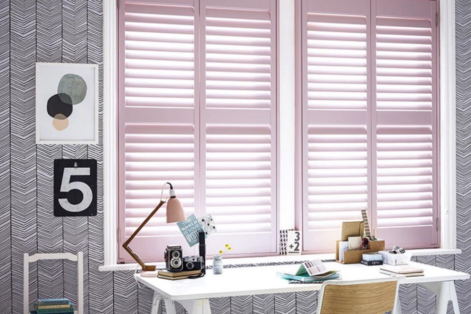
When it comes to huge furnishings and fixtures, neutral colours work well, but affordable accessories are the best way to add colour and texture to your home. Accessories give visual interest and contrast to space and may be readily and affordably changed to suit varying moods, trends, or seasons.
4. Raise the Ceiling Using Visual Tricks –
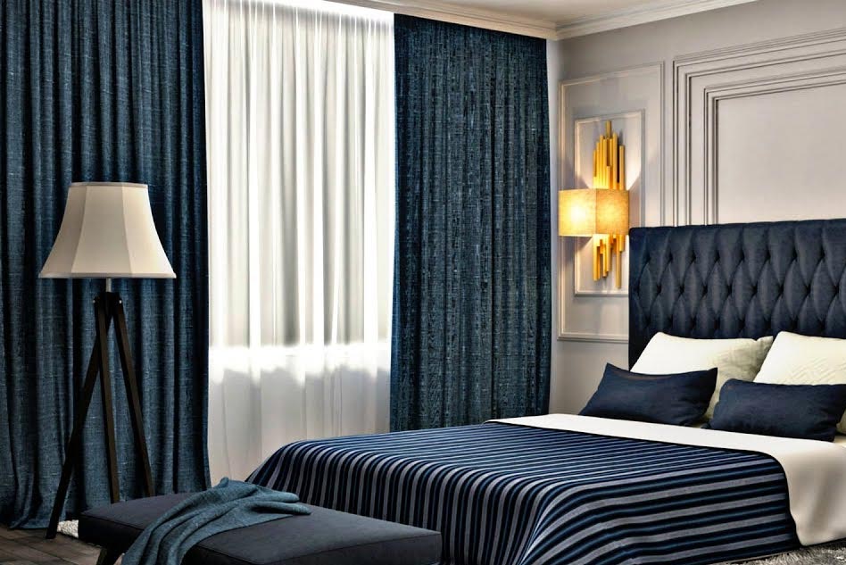
To open up a space that feels claustrophobic, use white paint on low-ceilinged areas. To give the appearance that the space is taller, it is recommended to put up curtains that are higher than the window frames. Most conventional curtain panels are 84 or 96 inches long, allowing you to hang them approximately 3 inches well above the window frame before they become too short.
If you wish to hang the drapes higher, you will need to order custom-made ones. Do you like patterned panels? Try vertical stripe wallpapers. The lines make your walls look bigger. Another trick that may be used to make a space look taller is to lean a big mirror against the wall.
5. Rugs Anchored Under Furniture Feet –
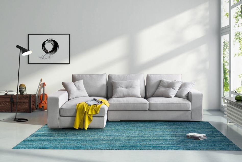
A rug should be used to define the seating space in a living room and should be large enough so that all four legs of a sofa and chairs may fit on it.
Even in living rooms with modest dimensions, an 8-by-10-foot or 9-by-12-foot rug is typically required to accommodate a patio. If you choose a too-small rug, everything will appear out of scale.
6. Combine Your Lighting –
Every space should have 3 types of lighting: ambient, task, and accent, which highlight the artwork. Minimum lighting requirements for a living room are 3 watts per square foot. One of the preferred visual tricks is to make use of uplights. Place an uplight in the corner of the room to create the appearance of space. It is recommended to use either a torchiere or an uplight.
7. Open up your kitchen to the fresh air and sunlight –
A bank of windows without drapes is preferable to an ugly one because coverings can become heavy and outdated over the period. Ideally, window treatments should be both practical and stylish: Full-length panels and sheers are a great combination.
You should use light colours in your space if it gets lots of sunlight. Cotton, silk, and linen combinations are the most suggested lightweight materials for panelling since they usually prefer to hang smoothly.
8. Neutral Wall Colours –
Stick to neutral colours such as beige and grey, particularly on the first floors, where flow is essential. Disruptive transitions should be minimised. For decorating, neutral walls are the most versatile, allowing you to change up your accessories quickly.
9. Stripes Can Be Magic –
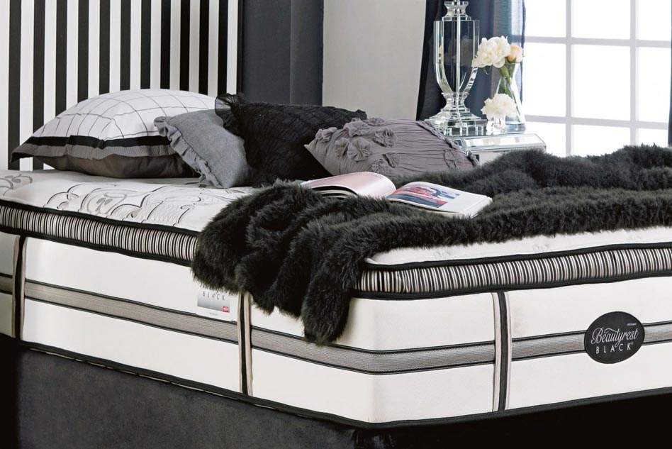
If you would like to blend several patterns in your home, stripes are the pattern you should focus on using because they can be used with virtually any other design. In addition, these patterns can be used in various ways because of their versatility.
The combination of these ikats and this striped sofa is amazing. It’s almost hard to find a pattern that doesn’t look very good with stripes.
Combining two striped chairs with the rest of the room’s colour palette. Even though the rug has a pattern, the stripes work well together.
Conclusion:
The most affordable way to improve the look of a room is with decorative items, however, if a decorator isn’t careful, these things can quickly take over the property. These basic ideas for selecting, integrating, and designing with Home Decor Accessories in Bangalore can assist you in bringing together your area like a pro and avoiding the common mistakes that many individuals make with their interior decoration.
The blending of patterns is scary. Decorating mistakes may be expensive, specifically for huge upholstery items, carpets, and curtains, so there is a lot to think about in terms of colours, scale, and pattern. The stakes are too high because of this, and there are many things to consider. However, there is a chance, and we, Curtain Spa, are here to assist you in overcoming your worries and comprehending how to blend patterns.


